
Today, most people use their smartphones to search for businesses, products and services. If your website does not work properly on a mobile phone, you may lose potential customers.
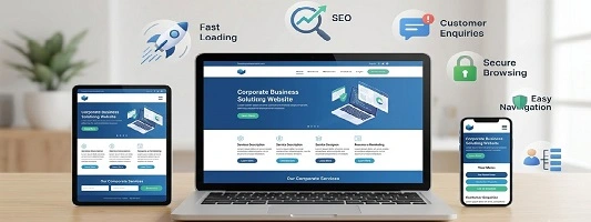
A mobile-friendly website automatically adjusts its layout according to the screen size. It should be easy to read, simple to navigate and quick to use on smartphones and tablets.
Why Does Your Business Need a Mobile-Friendly Website?
Most Customers Use Mobile Phones
People often search Google, check products and contact businesses directly from their phones. Your website should give them a smooth experience.
Better User Experience
Small text, difficult menus and buttons that don’t work properly can frustrate visitors. A responsive website makes browsing much easier.
Helps Your SEO
Mobile usability is an important part of providing a good search experience. A well-structured, mobile-friendly website can support your overall SEO strategy.
More Customer Enquiries
When your website works well on mobile, visitors can easily call, send a WhatsApp message, fill out a form or request a quotation.
Builds Trust
A modern website that works properly on phones gives visitors a better impression of your business.
What Should a Mobile-Friendly Website Have?
A good mobile website should be simple, fast and easy for visitors to use. Here are some important features:
- Responsive design
- Easy-to-read text
- Simple navigation
- Fast-loading images
- Clear contact buttons
- Mobile-friendly forms
- Properly sized buttons
- Secure HTTPS connection
Need a Mobile-Friendly Website?
Mediatronics Technologies provides responsive website design and development services in Pune for businesses, startups and professionals across India.
We create websites that are designed to work smoothly on desktops, tablets and smartphones.
👉 Contact Mediatronics Technologies